Les Déménageurs Bretons
Recruitment Exercise – Art Direction
This project was developed as part of a recruitment assignment for JCDecaux, designed to assess my skills in art direction, visual storytelling, and strategic thinking.
Working from an open brief, I independently developed the concept, creative strategy, and art direction through in-depth research and exploration.
A more detailed version of this project is available in French through the original slide presentation here: https://docs.google.com/presentation/d/1K0wwhUhaY84oNOVf4QBagYS3x0T1CRx_JnYDDXVk8eU/edit?slide=id.g36b10ece3c6_0_27#slide=id.g36b10ece3c6_0_27
Project Overview
Les Déménageurs Bretons is a well-known French moving company with a long-standing reputation for reliability and expertise.
The challenge was to modernise the brand’s visual communication while preserving its core values of trust, proximity, and professionalism, and to adapt this new direction to outdoor advertising.
The goal was to create a visual concept that would:
Reinforce brand recognition
Feel accessible and reassuring
Stand out in a public space environment
Speak to anyone going through a life transition
Design challenge:
How to build a strong and coherent art direction capable of reflecting both Les Déménageurs Bretons’ European expansion and their iconic regional identity, without losing authenticity or brand recognition?
Context & Brief
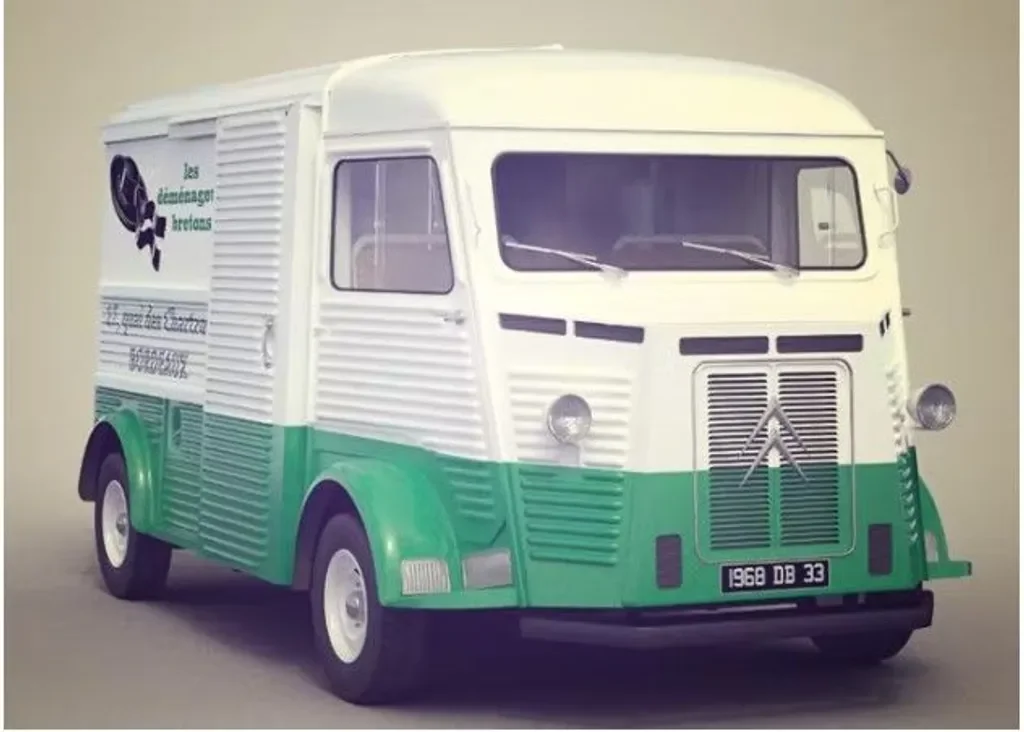
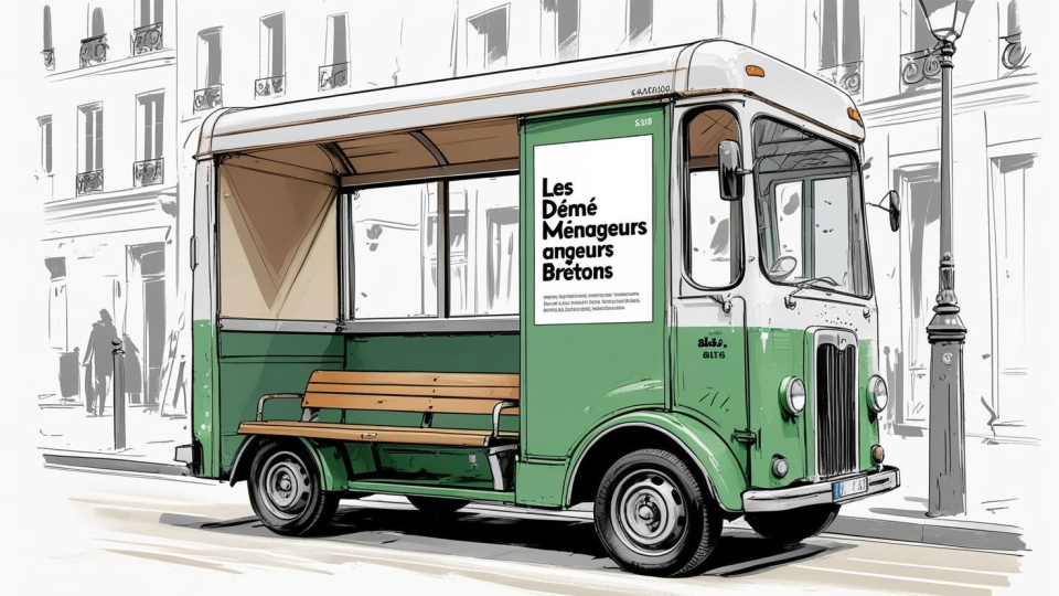
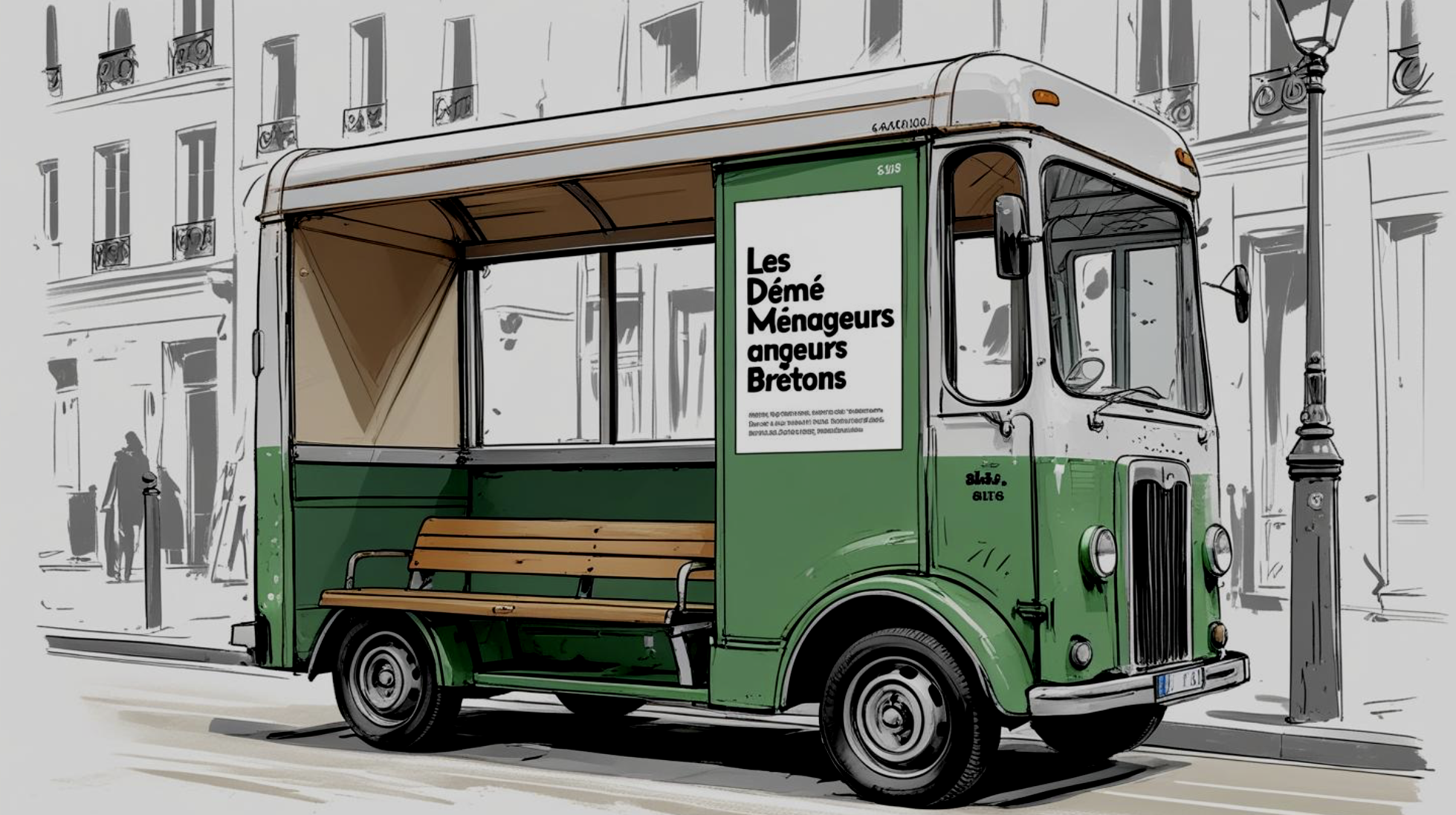
This photo represents one of their old moving vans, which was a big inspiration for the rest of the project.
Visual Outcomes
Moving is often associated with stress, uncertainty, and emotional transitions.
My creative direction focused on reassurance and human warmth, positioning Les Déménageurs Bretons not just as movers, but as trusted partners during an important life moment.
The concept comes to life through clear, reassuring visuals designed for urban public spaces. I decided to place them in train and subway stations, aswell as on bus stops. Placing the message in these spaces reinforces its emotional relevance, echoing the experience of moving itself.
The concept highlights and visuals
Calmness and clarity in moments of change
A sense of support and reliability
A friendly, human-centered tone rather than a purely functional one
Multiple outdoor advertising formats: Billboards, posters, bus stops and public space displays.
Each visual was designed to remain impactful even at a quick glance, while still conveying a reassuring and human message.
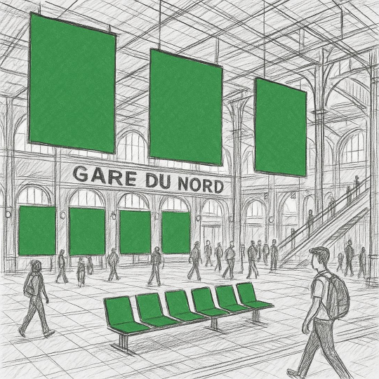
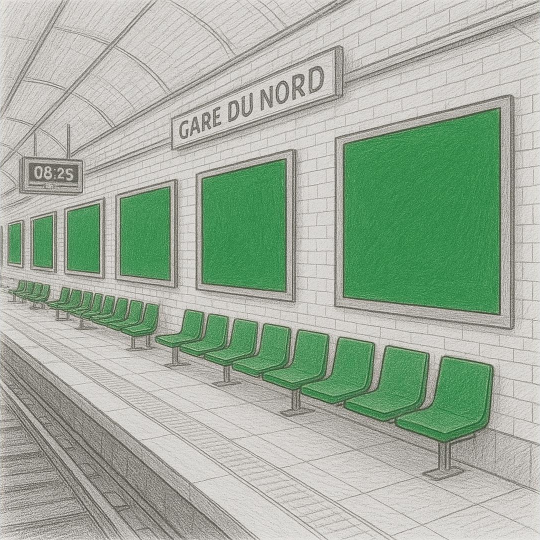
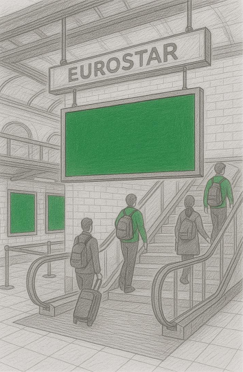
This sketch represents Gare du Nord, selected as a strategic campaign location.
As a major transport hub connecting Paris to London via the Eurostar, it reflects the brand’s European reach. The campaign takes over the station with large-scale billboards, while elements such as seating are reimagined in the brand’s signature color.
A prominent billboard was placed above the escalators leading to the Eurostar platforms to enhance visibility.
Art Direction Choices
The art direction seeks to balance local identity and European ambition, using familiar brand codes as anchors while adapting them to a broader, contemporary visual language.
Visual language
Simple and structured layouts that are easy to read at a glance.
A balance between photographic elements and graphic overlays
Visual hierarchy designed for fast understanding in public spaces
Color & mood
Soft yet confident color tones to evoke trust and calm
A modernized palette aligned with the brand’s identity while feeling more contemporary
Typography
Strong, readable typefaces suitable for large-scale formats
Clear contrasts to ensure accessibility and visibility from a distance
Tone & Messaging
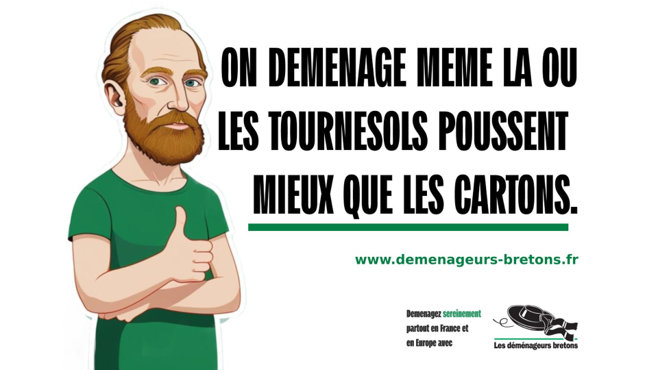
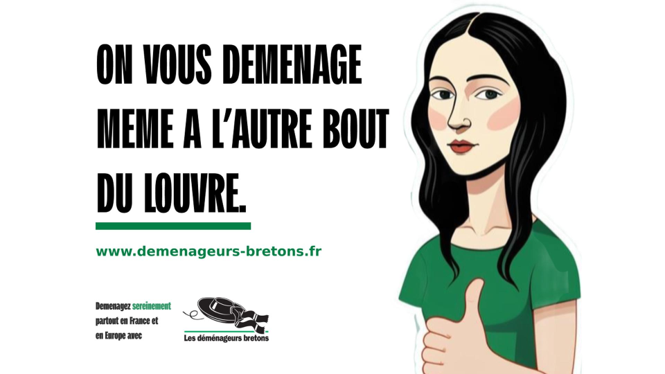
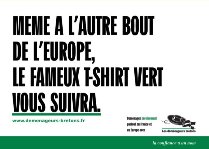
A familiar and humorous tone, inspired by the brand’s previous campaigns
Use of pop culture references as a direct nod to Les Déménageurs Bretons’ historical communication
Humor used as a tool to create recognition, proximity, and memorability
A tone designed to remain clear and effective in outdoor advertising contexts
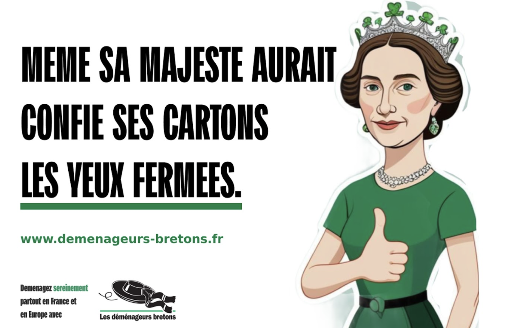
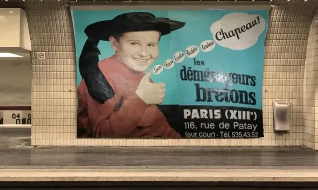
While doing my research, I noticed that Les Déménageurs Bretons place strong value on their history, which inspired me to integrate subtle references to one of their earlier campaigns.